Brand-Led Product Experience for Curly Hair Care
01. Overview
Why CurlQuest?
Curly hair care is personal.
I’ve lived the cycle of scrolling through endless advice, buying products that should work, and still walking away unsure of what my curly hair actually needs. And I’m not alone. Curly hair routines are often built through trial and error, trend cycles, and inconsistent information.
The deeper I looked, the clearer it became - the problem isn’t a lack of content.
It’s a lack of direction.
CurlQuest started as a question:
What would it look like to design a supportive curl care experience that helps people stop guessing and start building confidence through personalization?
Overview
This case study outlines how I designed CurlQuest, a concept mobile experience aimed at helping people with curly hair navigate product overwhelm and build routines that actually work for them.
By defining a clear brand direction and translating it into a guided digital experience, I created a product concept that feels supportive, personal, and easy to use. The result is a cohesive brand-led app experience that prioritizes clarity, confidence, and emotional connection.
Role
Brand Experience Designer, UX UI Designer
Tools
Figma, Figjam, Google Suites, Dribbble
Timeline
July - December 2024
Deliverables
UX Strategy, IA, Userflows, UI System, Interactive Prototype, Brand positioning, product experience design, visual direction, content strategy
02. Challenge
Curly hair advice is everywhere, but direction is missing
The challenge
The curly hair community often struggles to find reliable, tailored resources for their unique hair types. Existing solutions frequently default to one-size-fits-all guidance—leading to frustration, trial-and-error, and wasted time and money.
The market has historically catered more toward straight hair, which pushes curly-haired users toward influencer advice and experimentation just to figure out basic care.
Design Goals
The primary objectives for CurlQuest were to:
simplify the curly hair care journey
create a warm, confidence-building experience
guide users through assessment and discovery
organize information into clear, digestible steps
establish a visual identity that feels supportive rather than sterile
Rather than focusing purely on features, the goal was to design an experience that feels like a personal guide.
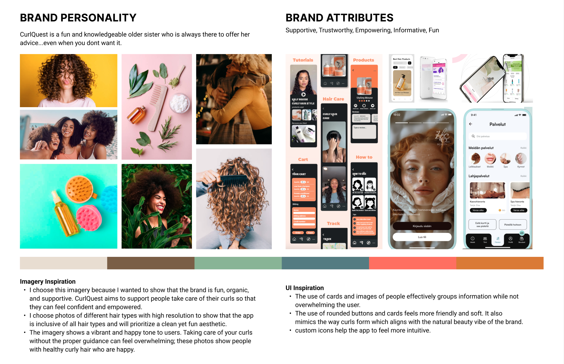
Brand Direction
Before designing screens, I established CurlQuest’s visual and emotional identity.
I explored:
soft, natural color palettes inspired by hair and skin tones
friendly, modern typography for approachability
rounded UI elements to reinforce warmth
visual cues that feel calm and encouraging
The brand direction was centered around being:
supportive · personal · inclusive · empowering
This creative foundation informed every interaction and layout choice.
CurlQuest was designed to feel less like a technical tool and more like a companion.
03. Discovery & Insights
Listening before designing
I approached discovery in two layers: secondary research to understand the broader landscape, then primary research to validate patterns with real curly-haired users.
Secondary Research: Mapping the ecosystem
Primary Research: Capturing how users choose products and routines
Jobs To Be Done: Framing real motivations
What CurlQuest needed to become
Secondary research revealed key conditions shaping the curly hair experience: underrepresentation in traditional beauty markets, overwhelming product variety with unclear suitability, and the influence of curly hair communities on buying decisions.
I ran a 10-minute survey to explore:
current routines and frustrations
how users find products/tutorials
budget considerations when purchasing products
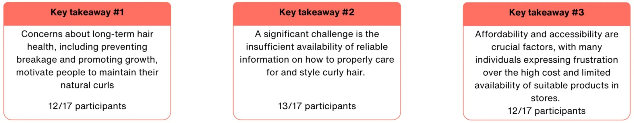
I distributed the survey through my personal network and received 17 responses, which refined my understanding of pain points and directly informed the app’s key features.
Using Jobs To Be Done, I reframed the problem around user intent:
Users want reliable guidance to improve hair health
Users want effective products within budget
Users want support transitioning to natural curls
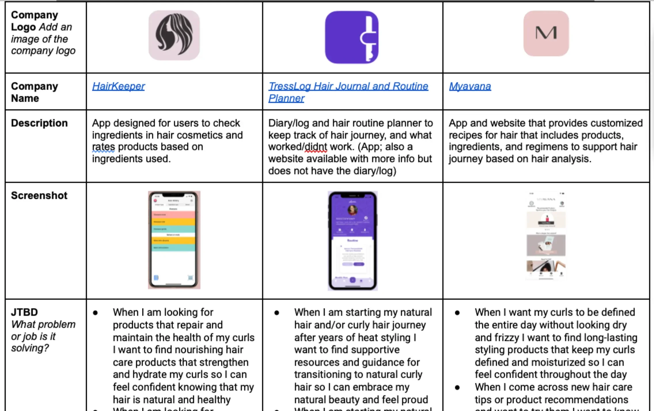
I also reviewed HairKeeper, Treslog Hair Journal, and Myavana. While these apps offer ingredient analysis or tracking, none connect assessment, education, and product discovery into one guided experience.
This gap shaped CurlQuest’s product direction.
Personalization first: Tailor content to curl pattern.
Clarity through structure: Reduce cognitive load through intentional organization.
Support at decision points: Guide users when learning routines and evaluating products.
These principles became the foundation of CurlQuest.
UX Strategy: What the product needed to do
The discovery phase clarified three strategic priorities:
Personalization as the foundation
Use curl pattern and hair context to shape what users see first.
Clarity through structure
Organize content so users don’t have to “figure it out” alone—reduce cognitive load through intentional grouping and hierarchy.
Decision support at key moments
Help users make choices when it matters most: when learning routines and evaluating products.
04. Strategy
Mapping a curl care journey
Design Goal
This meant creating a product that:
Information Architecture
Design a guided curl care experience that helps users move from uncertainty to confidence by combining personalization, structured learning, and budget-aware product discovery into one cohesive journey.
adapts to individual curl patterns
reduces cognitive overload through clear information hierarchy
supports decision-making when users are learning routines and evaluating products
Rather than building isolated features, the goal was to design CurlQuest as a connected system—where assessment informs education, and education informs product discovery.
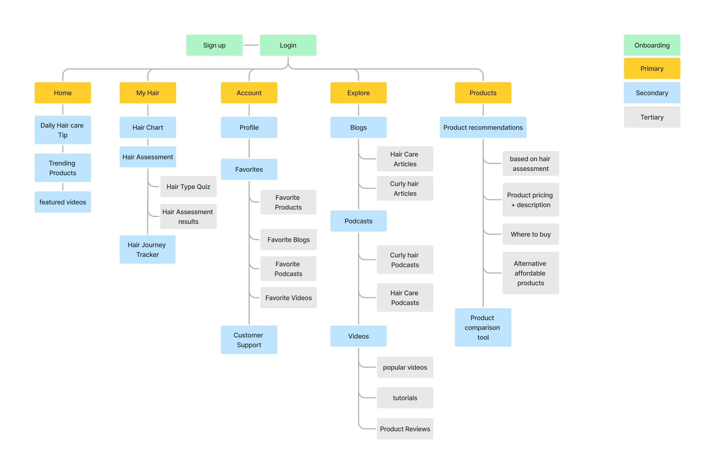
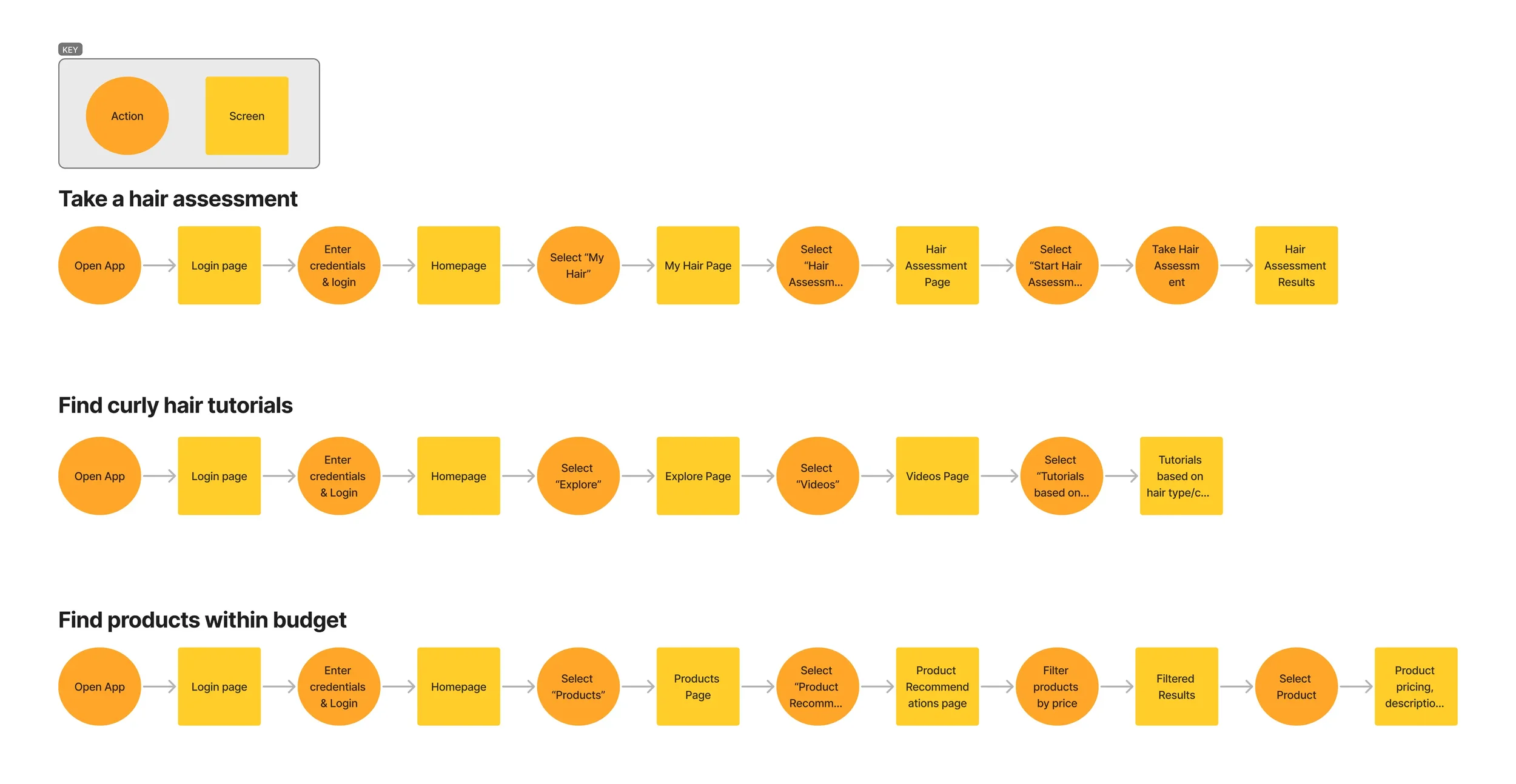
I translated this goal into a sitemap and three core user flows:
Take a hair assessment
Find curly hair tutorials
Discover products within budget
These flows established the backbone of the product and informed all design decisions moving forward
Content Strategy - Hook the user
Curly hair care is already saturated with information. The challenge wasn’t adding more content — it was organizing it in a way that feels approachable and actionable.
The content strategy focused on three principles:
Personalized first
Tutorials and product recommendations surface based on curl pattern so users immediately see what’s relevant to them.
Progressive disclosure
Instead of presenting everything at once, information is revealed gradually—helping users move through assessment, learning, and discovery without overwhelming the user.
Action-oriented learning
Content is framed around what users can do next (take an assessment, watch a tutorial, explore products), turning passive browsing into guided steps.
This approach supports recognition over recall and reduces decision fatigue by giving users clear paths forward.
Hierarchy through simplicity
Clean layouts and intentional spacing help users scan content quickly and understand what to do next.
Warmth without clutter
Playful color accents add personality while preserving white space to reduce cognitive load.
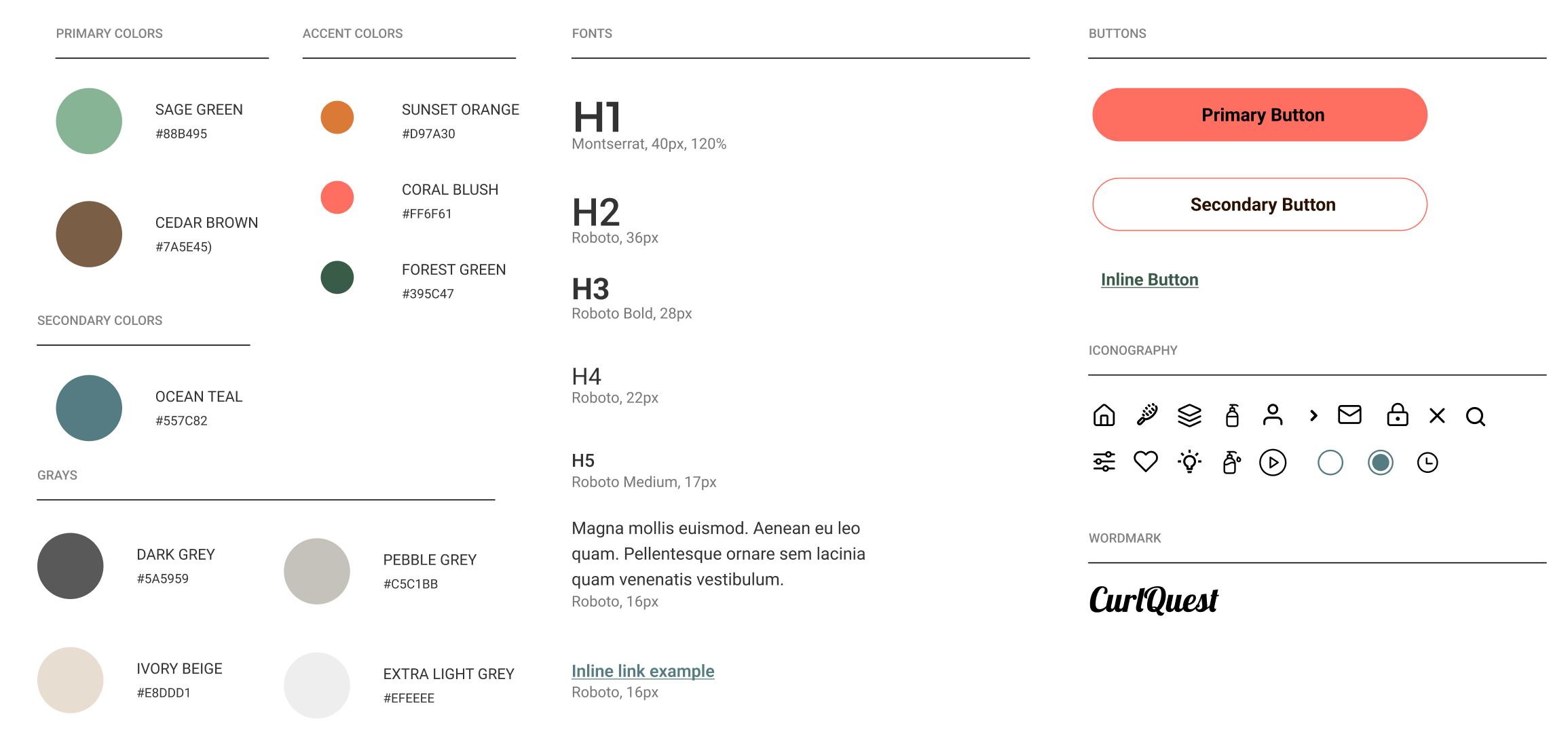
Readable by default
Roboto was selected for its clarity and accessibility across devices, supporting long-form educational content and product details.
Emotionally affirming design
Ocean teal communicates calm and stability, while coral accents signal energy and momentum—reinforcing the idea of progress within the curl journey.
Visual Strategy
The visual direction for CurlQuest was designed to support clarity, confidence, and approachability.
Curly hair care can already feel emotionally loaded and complex, so the interface needed to feel calm, supportive, and easy to navigate. The visual strategy focused on four principles:
Creating CurlQuest’s visual language
05. Design Execution
From concepts to screens
I explored solutions using Crazy 8s and HMW statements, then defined MVP user stories to clarify essential functionality.
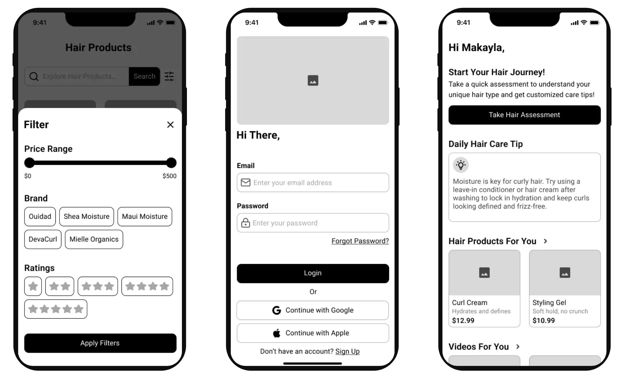
From there, I moved into sketching to validate layout direction, followed by low-fidelity wireframes focused on hierarchy and navigation. As designs progressed to mid-fidelity, I introduced real content to refine usability.
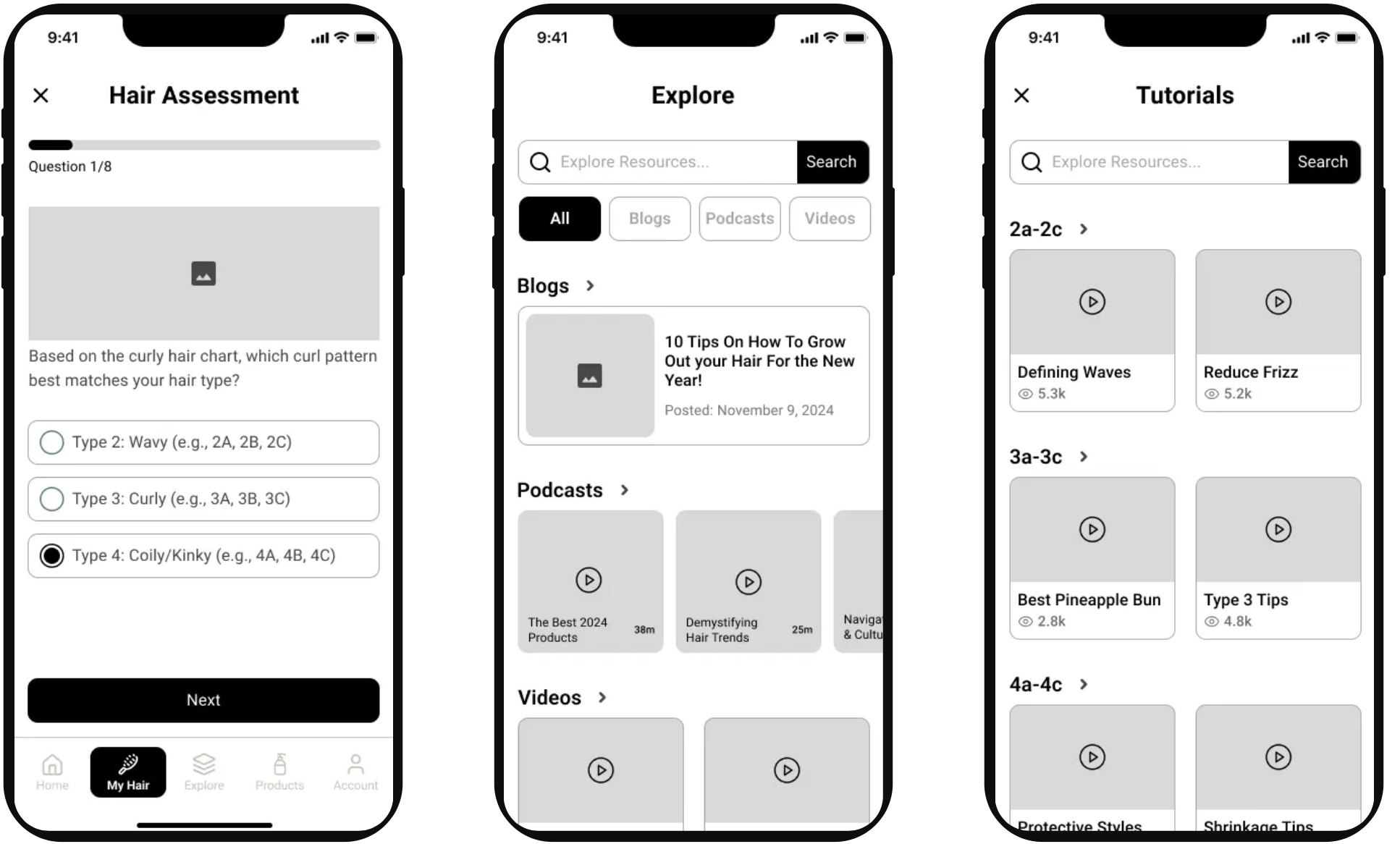
One key iteration was reorganizing the Hair Assessment Results screen so users could more easily understand their curl type and next steps.
I developed a moodboard and visual direction to balance warmth and clarity.
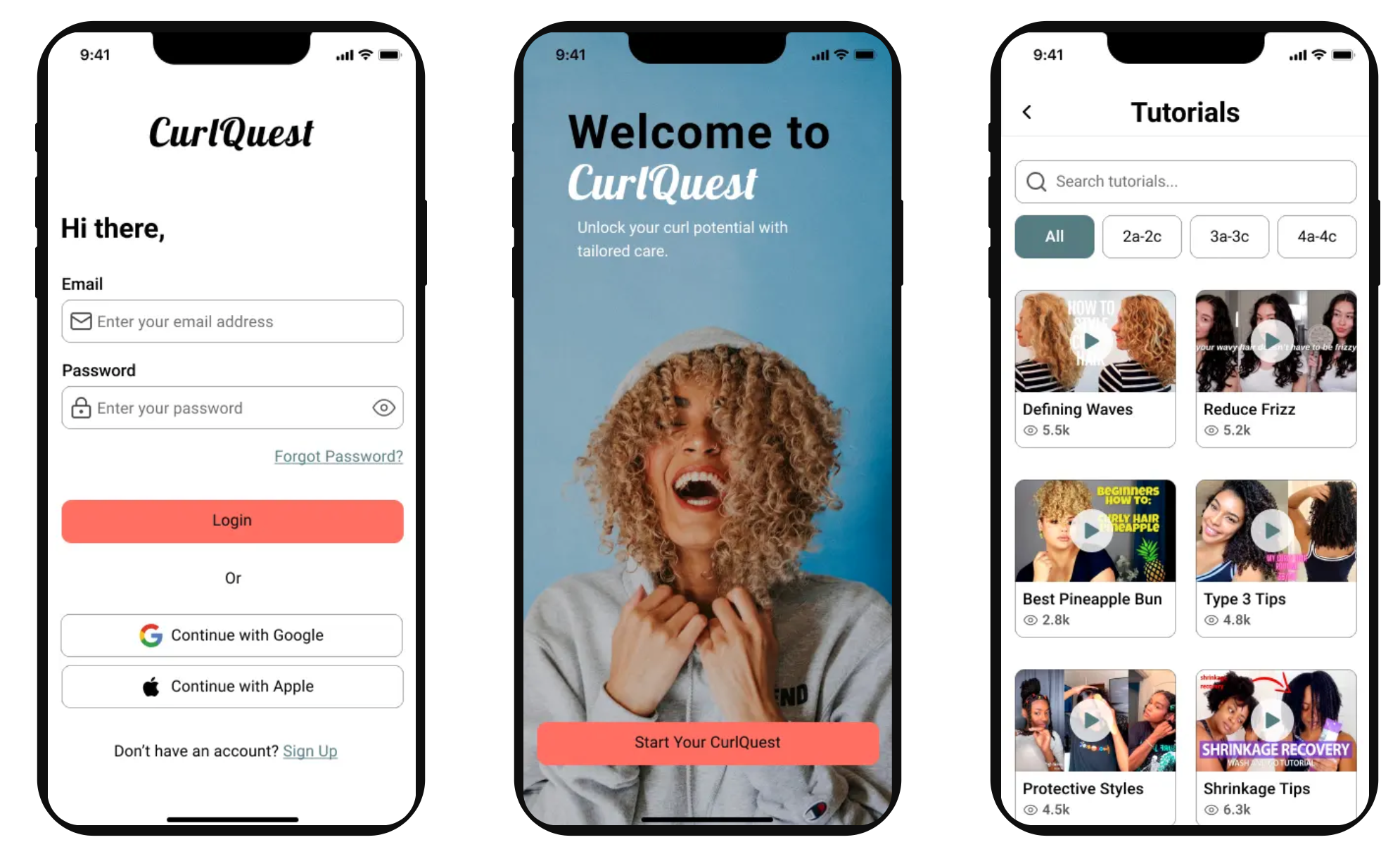
The name CurlQuest reflects a guided journey. Roboto supports readability, ocean teal communicates calm, and coral accents add energy and momentum. The UI emphasizes clean layouts and intentional spacing.
Prototyping the experience
I built a high-fidelity prototype in Figma connecting assessment, tutorials, and product discovery to validate end-to-end flow and interaction.
06. Testing & Iteration
Designing with real users
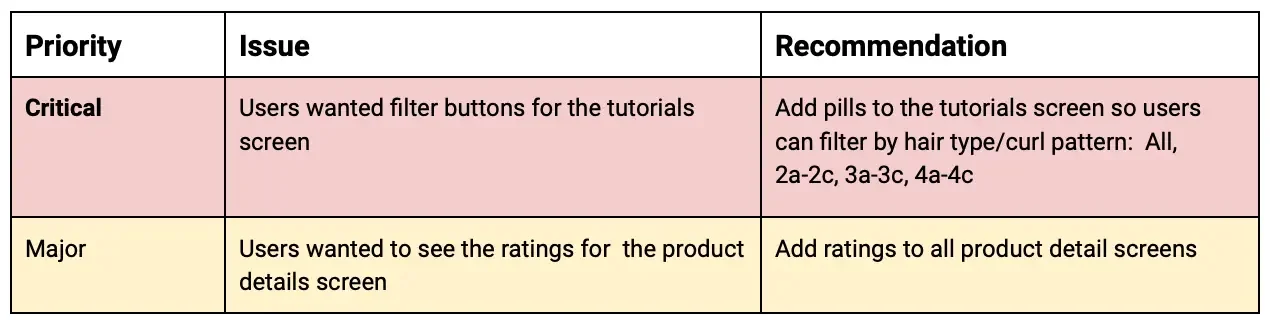
I conducted usability testing with 5 participants via Google Meets.
Two insights stood out:
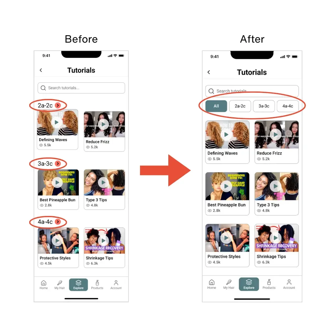
Users wanted filters on the Tutorials page to sort by curl type
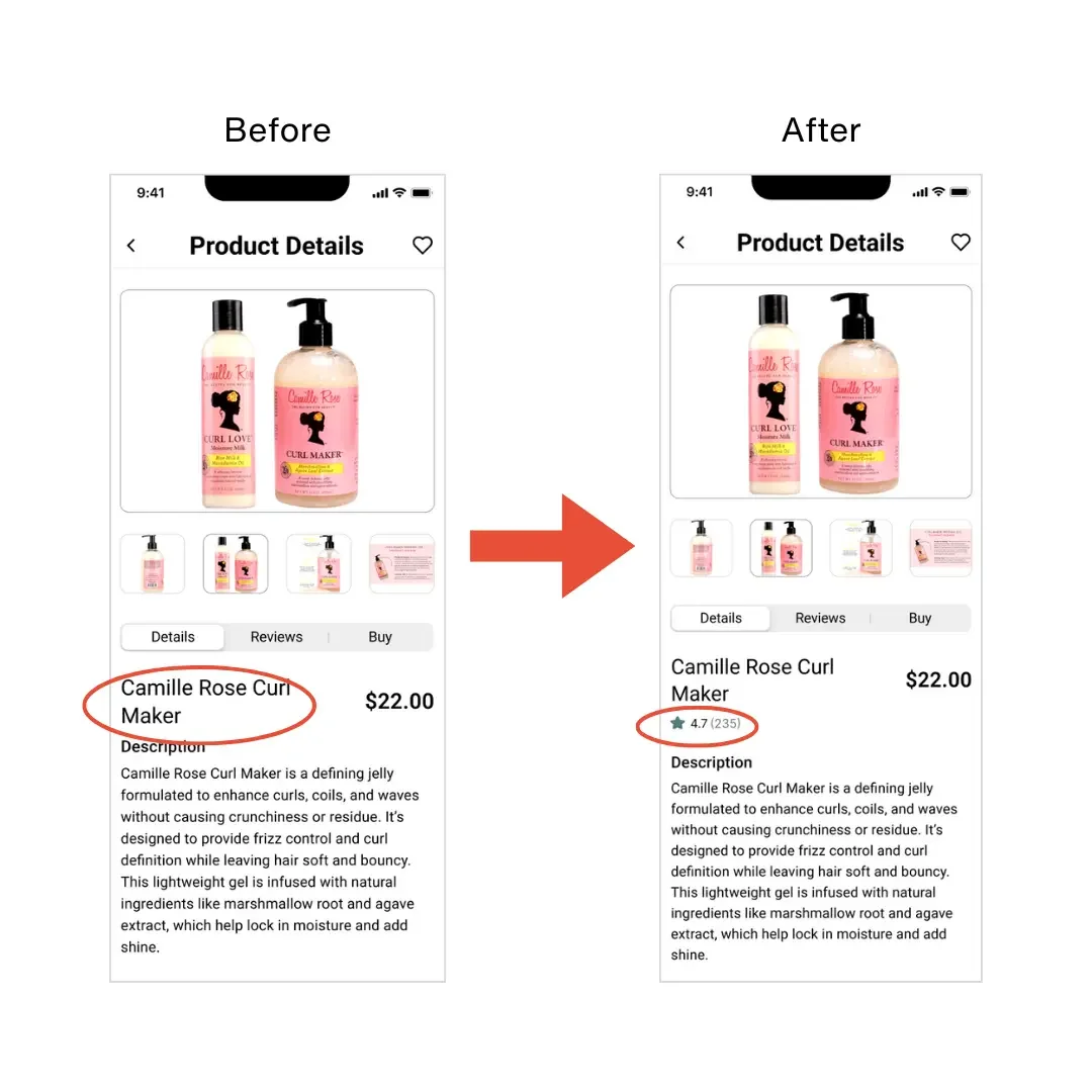
Users wanted product ratings to feel confident making purchase decisions
I implemented both:
added pill filters to tutorials
added star ratings and review counts to product pages
These updates improved clarity at key decision points.
07. Reflection
Designing for Confidence.
CurlQuest strengthened my approach to designing product experiences through a brand lens.
The project reinforced how visual direction, tone, and UX structure work together to shape user trust. It also highlighted the value of designing experiences that feel emotionally supportive — especially in spaces where users often feel confused or underserved.
This project deepened my interest in building digital products that combine usability with storytelling.